
Case Studies
Every brief we take on starts the same way. We listen.
Not just to what a client wants, but to what their business actually needs. What they’re trying to say. Who they’re trying to reach. What’s been holding them back. The work that follows looks different every time. A pub that needed to feel like itself again. A charity that needed a name to match its mission. A local business ready to grow into something bigger. But the approach is always the same: understand first, design second. These are some of the projects we’re proud of. Take a look at how we work.

Watermans
Project Overview
When Watermans approached us at Whitewater Creative, they needed a fresh identity for their new product, Frojus, aimed at individuals with curly, Afro-Caribbean, and hard-to-manage hair. They wanted the packaging to reflect the product’s luxury while standing out in a competitive market, and we were excited to help bring that vision to life.
Challenges the Client Was Facing Before Coming to Us
Watermans had a logo they loved, but the packaging concepts previously explored didn’t capture the premium feel they were aiming for. They wanted something that would speak to the values of their brand, stand out on the shelves, and resonate with their diverse customer base.
Read More
Our Approach and Process
We took the time to understand Watermans’ brand, diving into their existing designs and conducting a deep analysis of market trends. By truly listening to their vision, we knew a minimalist aesthetic would be key. Combining their brand’s existing fonts with handwritten elements, we aimed for a balance of sophistication and warmth. We also wanted to honour the natural ingredients of Frojus, so we used shades of green alongside their signature gold, and created graphics that would reflect the curly, textured hair the product is designed for.
Our Solutions and Outcomes for the Company
Through close collaboration with the Watermans team, we developed mock-ups of the packaging, giving them a real sense of how the finished product would look. Together, we narrowed the options down to two that truly captured the luxury and ethos of Frojus. The final design now speaks to the high-quality ingredients, the brand’s customer-first approach, and its desire to create meaningful impact.
The Results and the Impact They Had on the Company
The new packaging has elevated Frojus, communicating its luxury while standing out in a crowded marketplace. It resonates with Watermans’ core values and strengthens the emotional connection with their customers. With this refreshed identity, Frojus is ready to make a lasting impact, just as Watermans has always done.
Six Bells
Project Overview
The Six Bells restaurant approached us with a vision to refresh their brand identity. This project involved designing new branding elements, including menus, promotional materials, staff uniforms, and additional branding assets. Their aim was to enhance the overall customer experience by ensuring that every touchpoint, from the menu to the staff uniforms, reflected a polished, cohesive identity that aligned with their offerings.
Challenges the Client Was Facing Before Coming to Us
The client needed a refreshed and more cohesive brand identity. Their current materials lacked consistency, and the presentation of the restaurant felt somewhat outdated. Six Bells wanted to elevate its customer experience through a more professional and refined appearance while remaining true to its personality. They needed a unified design across all their restaurant materials, ensuring that their branding was consistent and appealing to customers both visually and emotionally.
Read More
Our Approach and Process
We started by listening closely to Six Bells’ vision for the rebrand. Understanding the need for consistency and polish, we developed a comprehensive brand design strategy. Our approach included not just new menus but also marketing assets and merchandise. The aim was to ensure that each piece, whether print or digital, complemented one another and communicated a cohesive, inviting experience to their customers. We worked closely with the team at Six Bells to ensure that the design reflected both their vision and the high standard of service they wished to provide.
Our Solutions and Outcomes for the Company
The rebranding introduced a suite of high-quality print and digital assets, including updated menus, promotional materials, and staff uniforms. The new design brought clarity and cohesion, strengthening Six Bells’ visual identity. These changes were carefully designed to not only improve the appearance of the restaurant but also enhance the overall customer experience. Every detail, from the menu layout to the uniforms, was thoughtfully aligned to present a unified, professional look that invited guests to enjoy a refined dining experience.
The Results and the Impact They Had on the Company
The rebrand had a profound impact on Six Bells. The cohesive new look enhanced customer engagement and contributed to a positive shift in brand perception. With a more polished and professional presentation, the restaurant’s branding now more accurately reflects its offerings, appealing to a broader audience. The updated materials have made the brand feel more modern and approachable, which has strengthened its connection with customers and positioned Six Bells for continued success.


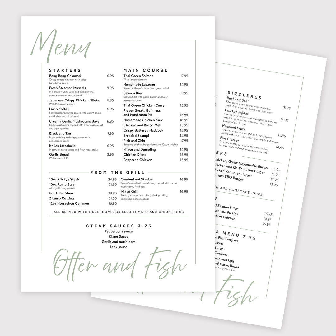
Otter & Fish
Project Overview
Otter and Fish approached us to design a complete set of menus, including a main menu, a light lunch menu, and a trifold takeaway leaflet. The goal was to create a refined, cohesive look that aligned with their brand identity, ensuring the menus were both visually appealing and easy to use.
Challenges the Client Was Facing Before Coming to Us
The restaurant needed a well-structured and professional menu design that matched its branding. The existing menus were not as polished as they needed to be, and the challenge was to develop a design that was not only attractive but also easy to read and navigate. The new design had to elevate the customer experience while maintaining the restaurant’s brand aesthetic.
Read More
Our Approach and Process
We developed a clean and modern layout that featured a soft colour palette and elegant typography. This approach helped convey a refined, upscale feel while remaining approachable. The design was focused on simplicity, ensuring that all menu items were easy to read and that the overall layout was visually appealing. We took care to create an inviting atmosphere through the thoughtful use of space and design elements.
Our Solutions and Outcomes for the Company
The menus were designed in multiple formats, allowing for flexibility across both print and digital platforms. We also created a trifold leaflet, which provided an easy-to-navigate format for customers to take away with them. This ensured that the restaurant’s branding was consistent across various touchpoints and offered an efficient way for customers to enjoy their dining experience, even after they had left the restaurant.
The Results and the Impact They Had on the Company
The refreshed menus provided Otter and Fish with a polished, professional presentation that elevated the dining experience for customers. The new designs helped improve brand consistency across all materials and enhanced the overall presentation of the restaurant. This rebranding has supported the restaurant’s image as a sophisticated yet welcoming venue, reinforcing their commitment to quality.
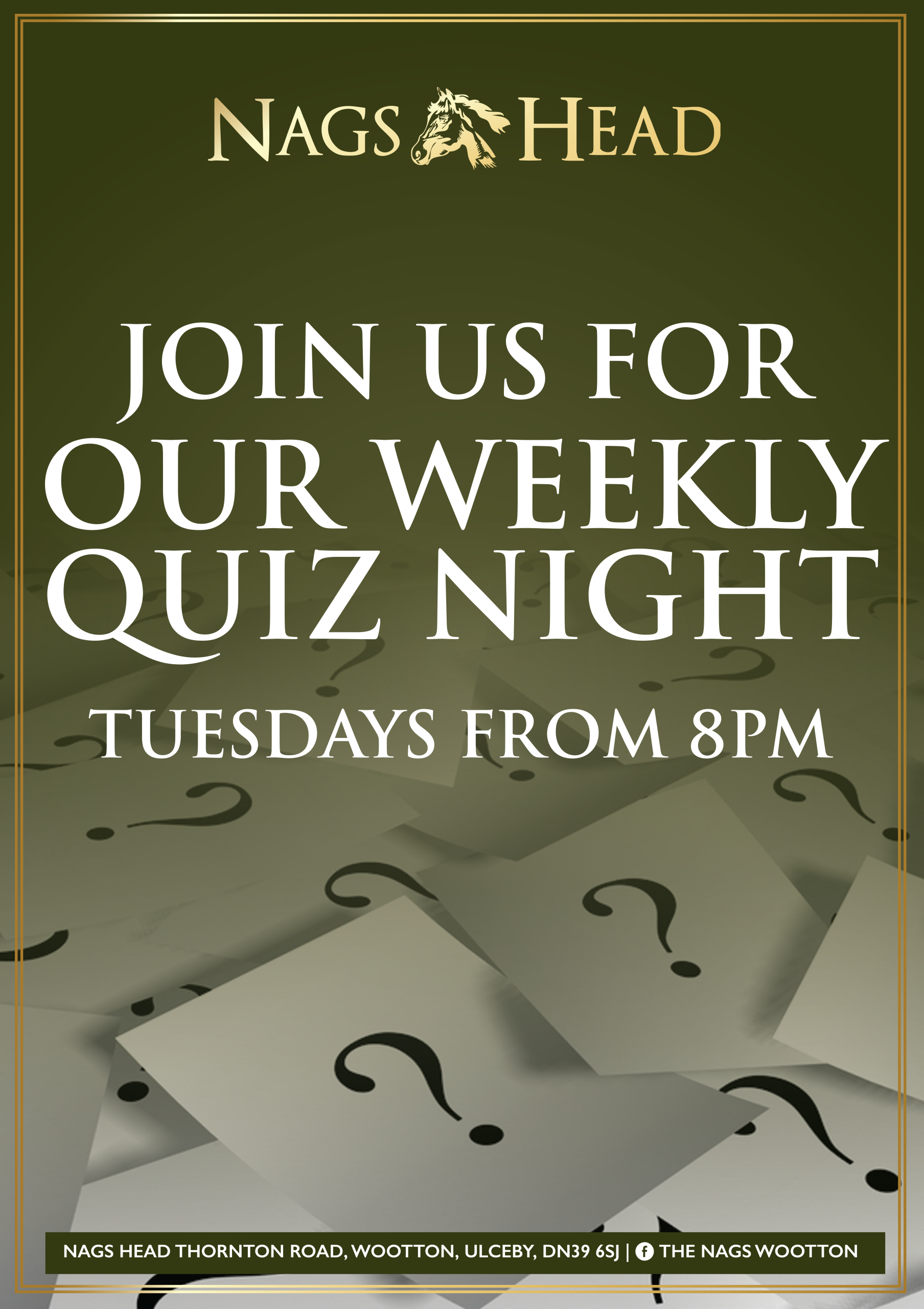
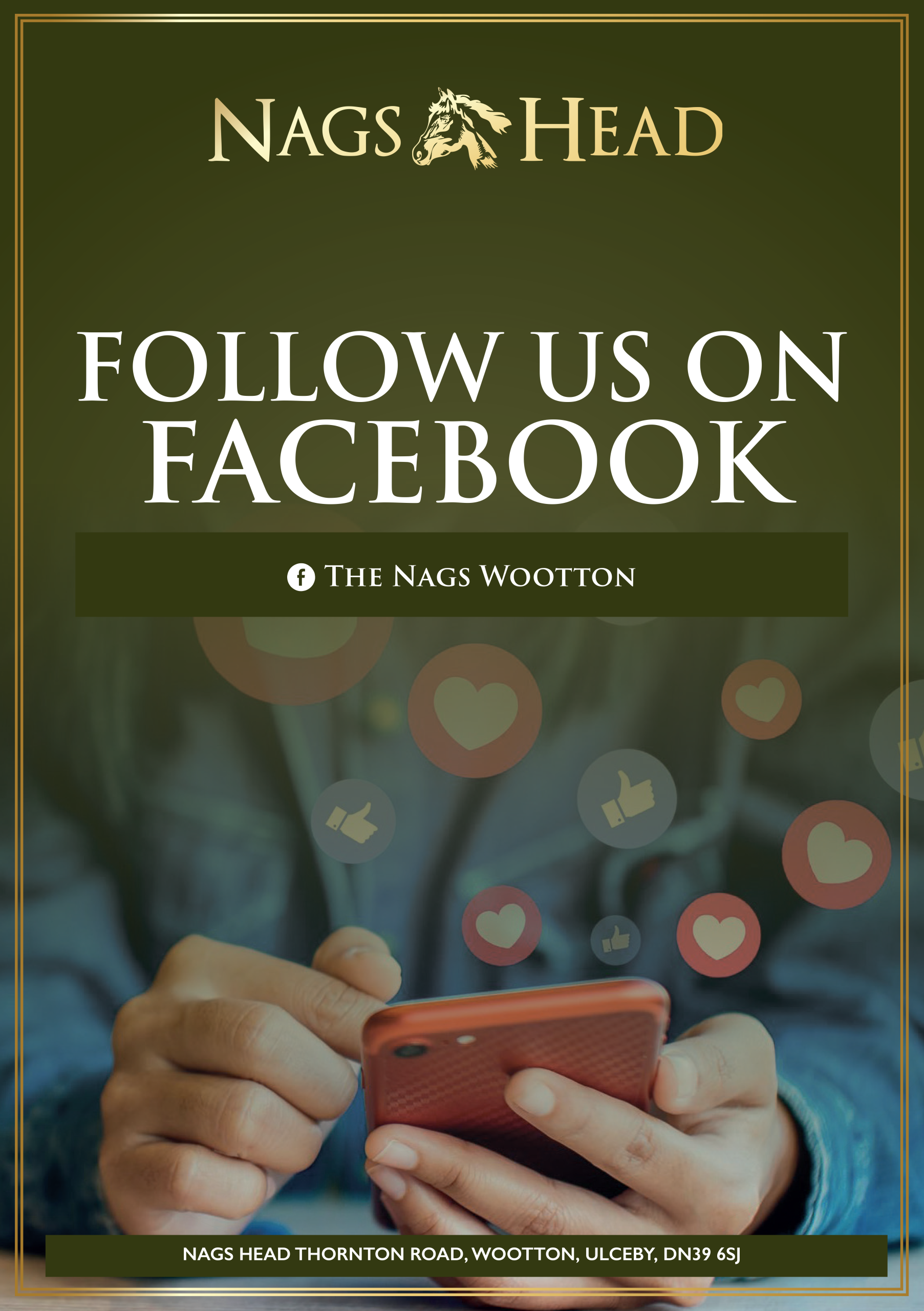
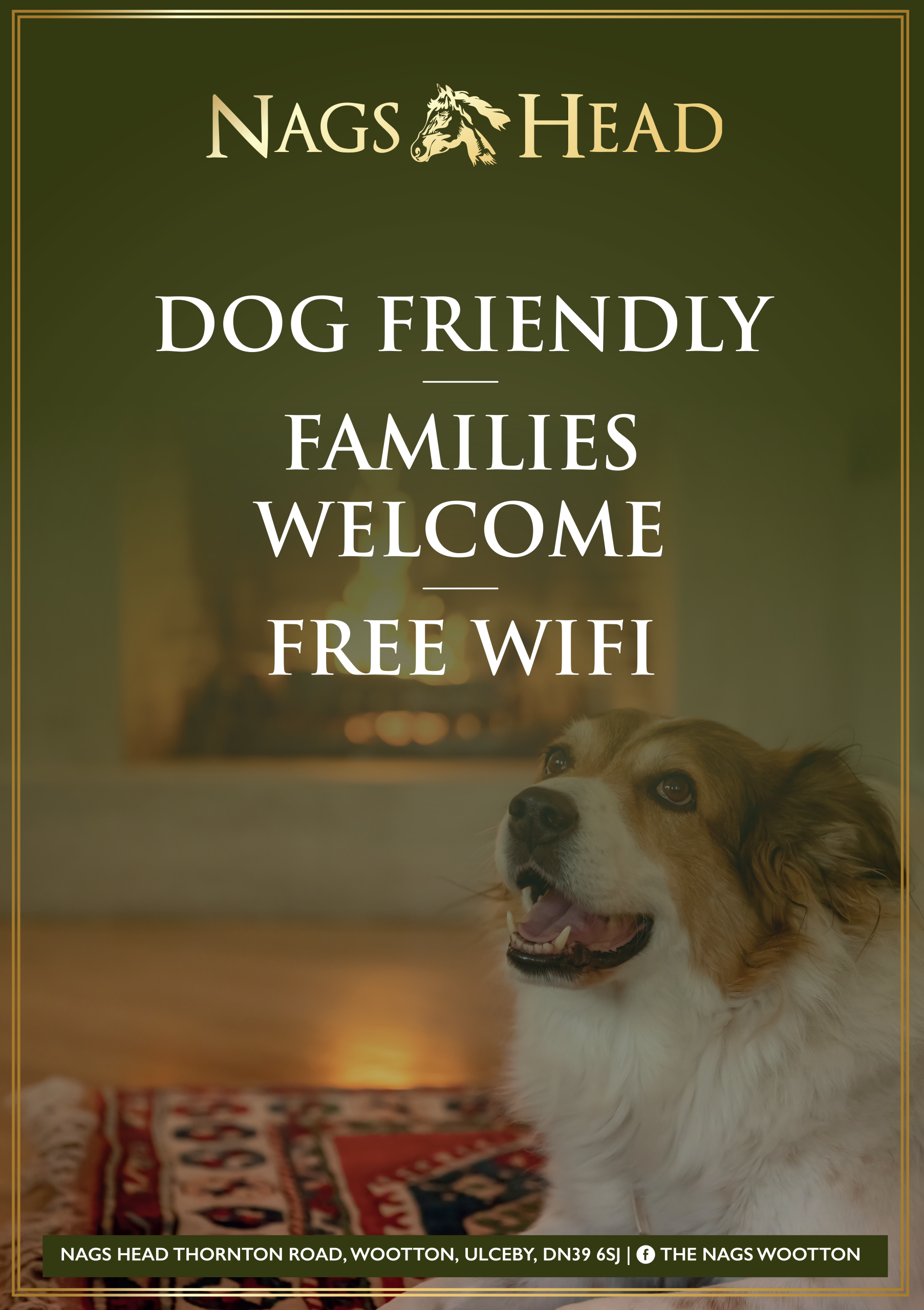
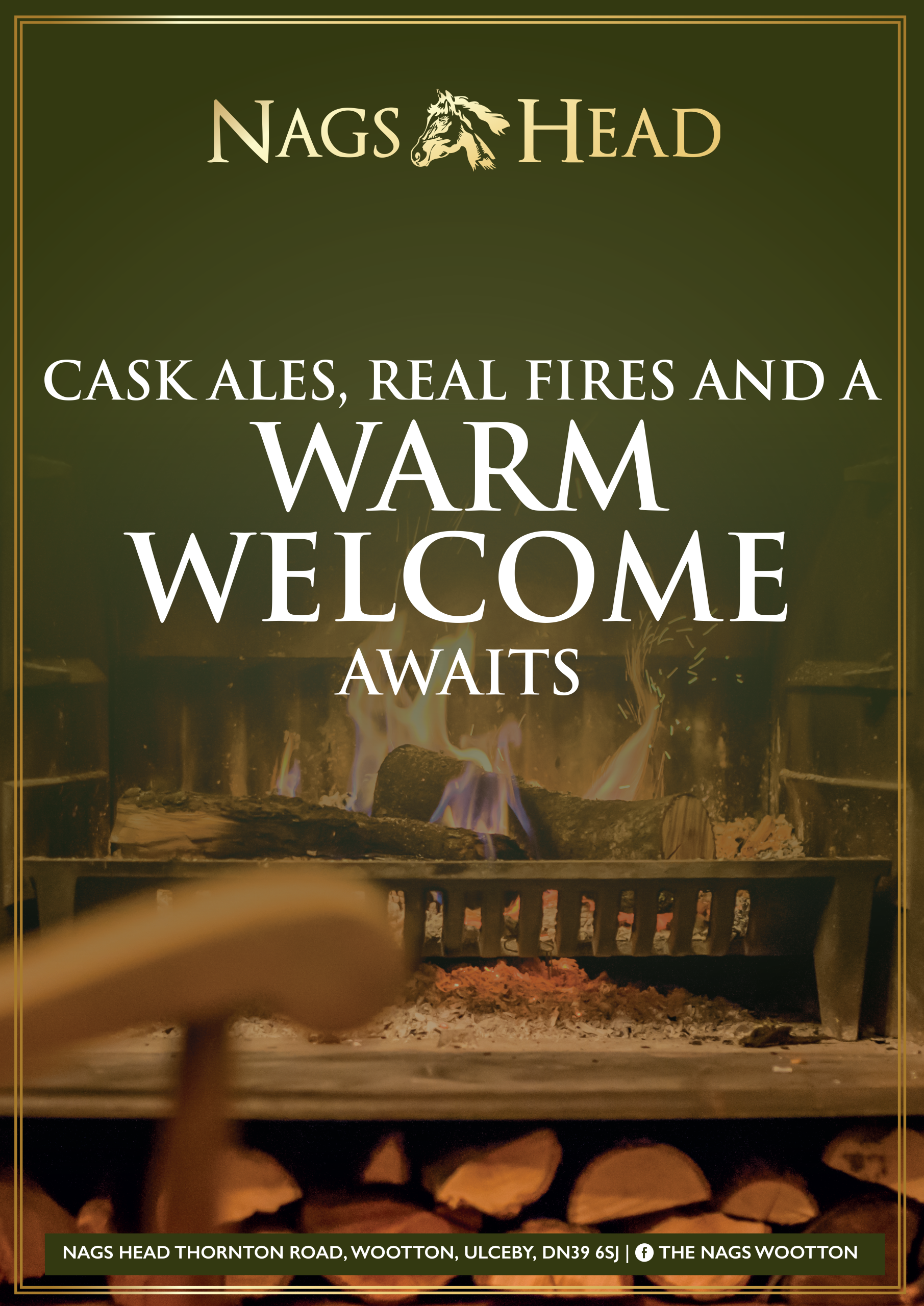
Nags Head
Project Overview
We were tasked with providing artworking services for a series of posters to promote various aspects of the Nags Head pub. The posters covered a range of topics, including upcoming events, food offerings, and pub amenities, helping the pub communicate its diverse offerings to customers.
Challenges the Client Was Facing Before Coming to Us
The Nags Head needed high-quality promotional materials that aligned with their established branding. They required a set of consistent posters that could effectively highlight various events and offerings within the pub, all while maintaining a cohesive visual style. The challenge was to create materials that could cover a broad range of topics, each with its own message, without compromising on design or brand consistency.
Read More
Our Approach and Process
The design for the posters was already established, so our focus was on efficiently rolling out multiple versions. We sourced commercially free images and carefully input the necessary text for each poster. Each design was resized for different orientations, ensuring they could be used across a variety of formats. The aim was to make the process as streamlined as possible, ensuring consistency across all materials while staying aligned with the pub’s brand guidelines.
Our Solutions and Outcomes for the Company
We delivered a complete set of professionally formatted posters, each tailored to promote specific aspects of the Nags Head pub. These included sports screenings, live entertainment, Sunday carveries, beer garden offerings, home-cooked food, welcome messaging, quiz nights, and social media promotion. The posters were designed to be eye-catching and informative while maintaining a cohesive look across the entire set.
The Results and the Impact They Had on the Company
The newly designed posters provided a cohesive promotional presence throughout the pub, reinforcing the Nags Head’s identity and offerings. They helped drive customer engagement by clearly communicating upcoming events and services while also enhancing the atmosphere within the pub. The consistent branding across all materials has strengthened the pub’s overall marketing efforts, ensuring that customers always know what’s on offer.


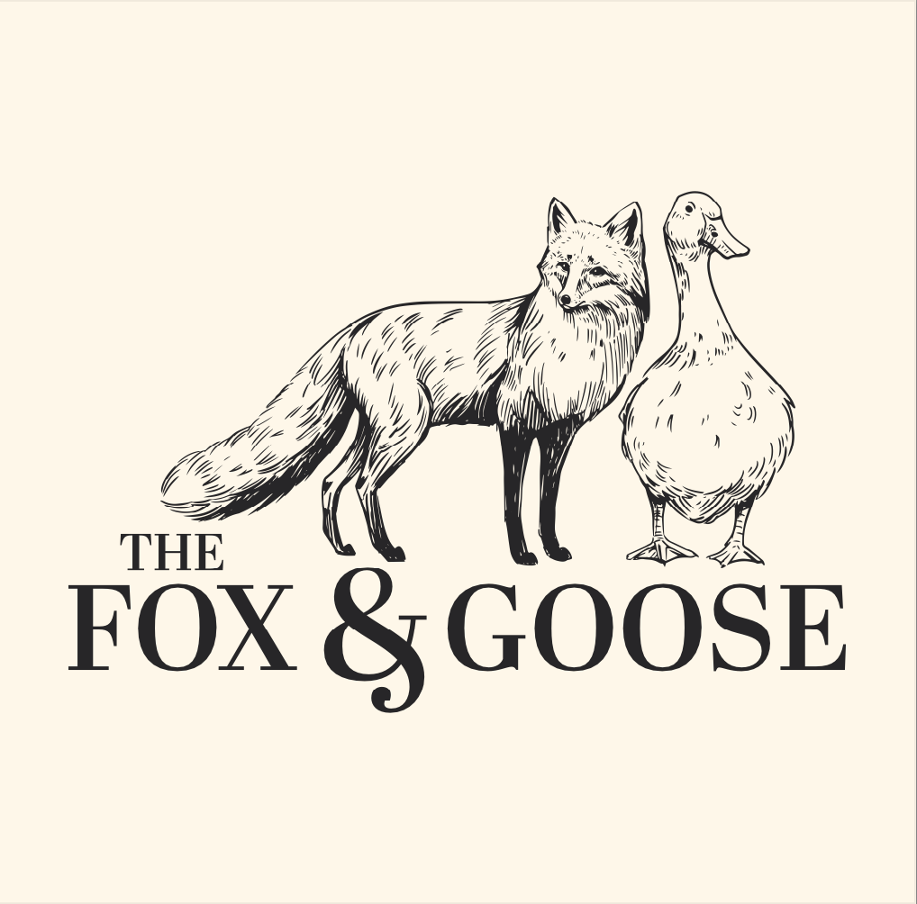
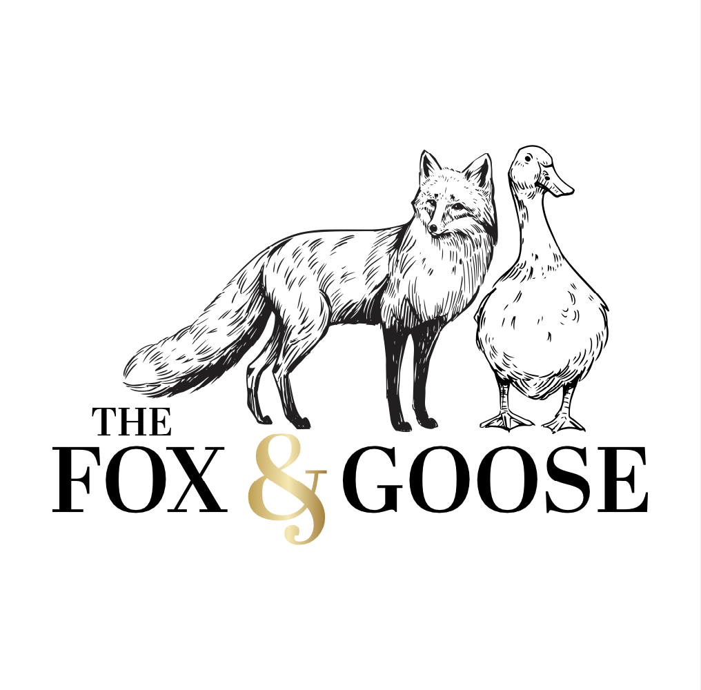
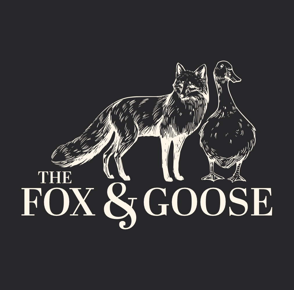
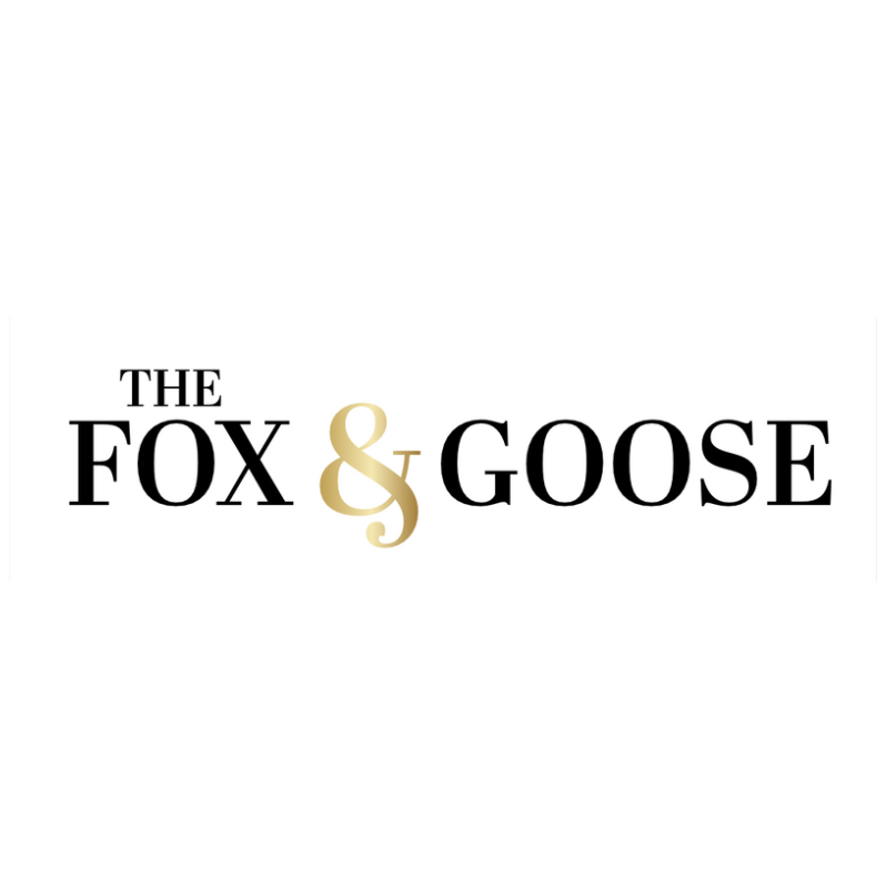
Fox & Goose
Project Overview
Fox and Goose, a popular pub, approached us with the need to refresh their brand identity. Their existing logo was no longer reflecting their character or vision, and they wanted a new design to strengthen their visual presence and support future branding efforts.
Challenges the Client Was Facing Before Coming to Us
The pub’s previous branding lacked a cohesive identity. Without a distinct logo, they struggled to create a consistent brand presence that could stand out. They needed a fresh logo to establish a strong visual identity that could be used across various touchpoints, from signage to promotional materials, and help pave the way for future growth.
Read More
Our Approach and Process
We began by drawing inspiration from the pub’s name, “Fox and Goose,” to create a logo that felt natural and distinctive. The design needed to be adaptable for a range of uses, whether on signage, menus, or promotional materials. Our focus was on ensuring the logo was not only visually appealing but also versatile and functional for all the pub’s branding needs.
Our Solutions and Outcomes for the Company
We delivered a full logo design alongside a text-only version, offering flexibility for various applications. The clean, cohesive design with carefully selected colours ensured that the new identity was aligned with the pub’s brand vision. This allowed the pub to have a unified look across all materials, making their branding feel more polished and professional.
The Results and the Impact They Had on the Company
The new logo provided a solid foundation for Fox and Goose to build upon. With their refreshed identity, they now have the flexibility to pursue a wider range of branding opportunities with confidence. The cohesive design has enhanced the pub’s visibility and helped it establish a stronger presence, both with existing customers and potential new ones.
Idea Developers Of East Anglia - IDEA
Project Overview
IDEA is a Suffolk-based creative collective that supports large-scale projects like Sizewell C, specialising in marketing, website development, and design. To help the collective stand out, we developed a new branding and visual identity that reflects both their creative approach and professional expertise, ensuring they appear both innovative and credible.
Challenges the Client Was Facing Before Coming to Us
IDEA needed a distinct, modern, and professional brand identity that could effectively represent their creativity and innovation while also establishing credibility for the significant projects they work on. The challenge was to create an identity that balanced creative flair with trust and authority, making it suitable for both local businesses and large-scale partners.
Read More
Our Approach and Process
We designed a logo that incorporated a lightbulb icon with crown-like details, symbolising creativity, innovation, and regional heritage. The lightbulb represents ideas and innovation, while the crown-like elements connect the branding to local roots. A vibrant pink and navy colour palette was selected to balance energy with professionalism, allowing IDEA to stand out while maintaining an air of trust. Alongside the logo, we created additional brand assets, such as letterheads and forms, to maintain consistency across all materials and communications.
Our Solutions and Outcomes for the Company
The new branding provided IDEA with a cohesive and vibrant visual identity that effectively captured its dynamic and professional nature. The bold colour palette of pink and navy balanced energy and professionalism, while the logo communicated the collective’s innovative approach. The additional branding materials reinforced the overall consistency of the brand, making it suitable for a wide range of applications.
The Results and the Impact They Had on the Company
The refreshed branding established a strong identity for IDEA, making it more recognisable and appealing to local businesses and large-scale project partners. The new visual identity enhanced credibility, reinforcing the collective’s ability to handle significant projects like Sizewell C while showcasing their creativity and innovative approach.


St Edmund’s Day Dinner
Project Overview
We developed the branding and event materials for the St Edmund’s Day Dinner, an annual black-tie charity event organised by the Rotary Club of Bury St Edmunds Abbey. The goal was to create materials that reflected the event’s prestigious nature while supporting its fundraising efforts and enhancing attendee engagement.
Challenges the Client Was Facing Before Coming to Us
The St Edmund’s Day Dinner required a strong, historically rooted brand identity to reflect the significance of the event. The Rotary Club needed professional materials that would not only attract attendees but also help convey the importance of the charity’s mission and support the fundraising objectives. The challenge was to develop a cohesive visual identity that conveyed the event’s heritage while maintaining a polished and professional feel.
Read More
Our Approach and Process
We started by designing a logo that reflected the rich heritage of St Edmund, tying into the historical significance of the event. The branding was then applied to a range of event materials, including an evening programme, auction materials, a thank-you letter, and table plans. The design was focused on consistency, ensuring each piece maintained a high-end feel, with thoughtful attention to detail throughout the event’s branding and print materials.
Our Solutions and Outcomes for the Company
We delivered a cohesive visual identity and refined print materials that elevated the event’s overall prestige. The event branding helped communicate the significance of St Edmund’s Day Dinner while ensuring that all materials were professionally presented. This approach gave the event a unified, polished look, contributing to a memorable experience for attendees and enhancing the fundraising efforts.
The Results and the Impact They Had on the Company
The St Edmund’s Day Dinner raised £8,000 for charity, making a significant impact on the supported cause. The refined branding and high-quality printed materials strengthened the event’s identity for future years, ensuring that attendees experienced a well-executed, memorable event. The professional materials helped reinforce the dinner’s importance and elevated its standing as a prestigious charity event within the community.
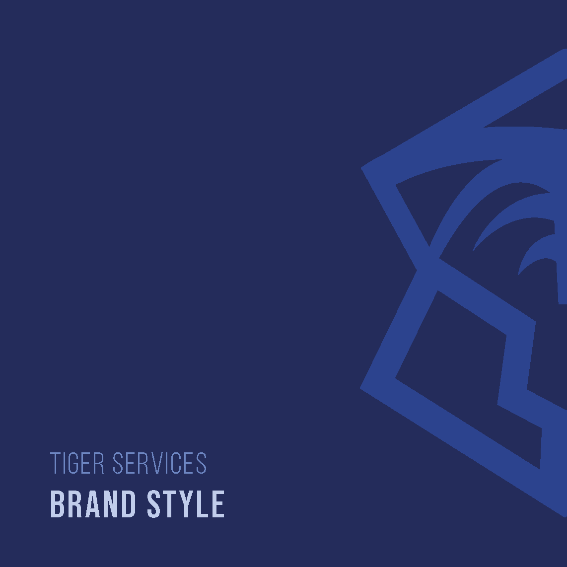
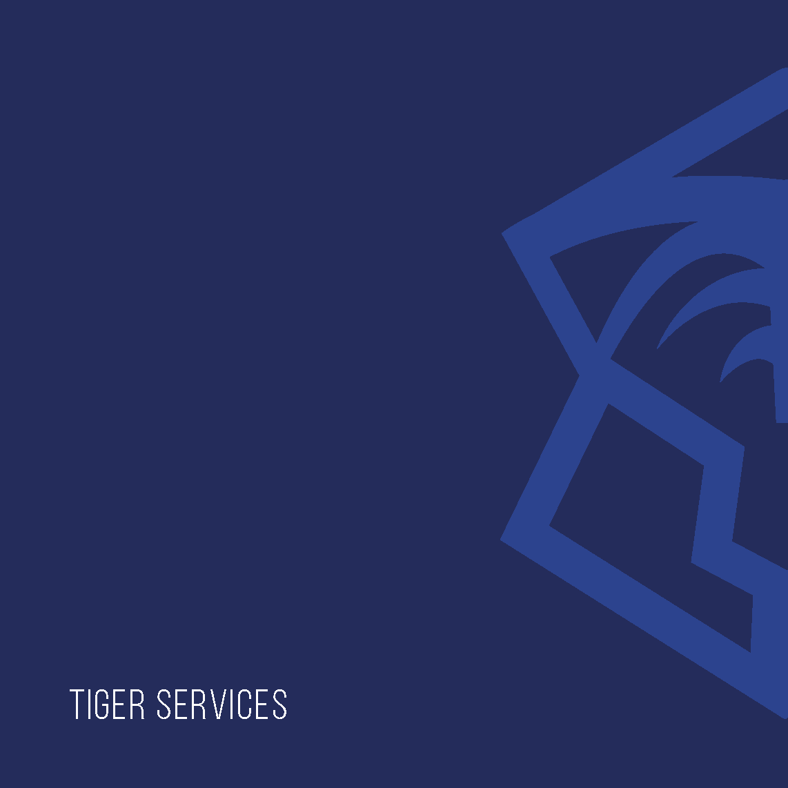
Tiger Services
Project Overview
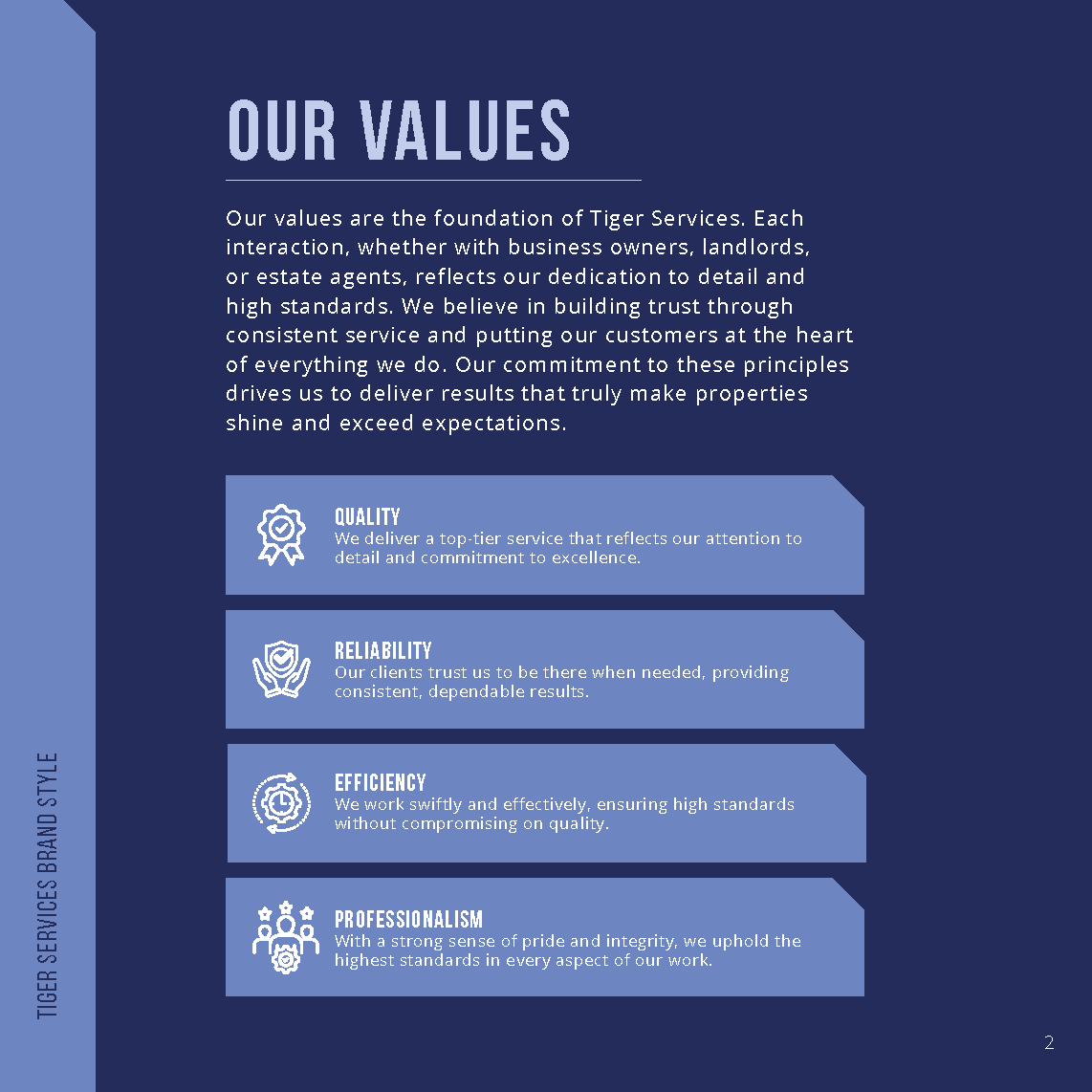
Tiger Services, a local cleaning and maintenance company, approached us with big ambitions to evolve into a full-scale facilities management brand. They sought our help to develop a clear and cohesive brand identity that would reflect their professionalism, reliability, and long-term vision. With both domestic and commercial audiences in mind, the goal was to create a visual identity that felt strong yet approachable, mirroring the pride and precision they bring to every job.
Challenges the Client Was Facing Before Coming to Us
Before we came on board, Tiger Services faced several key challenges. Despite consistently delivering high-quality services, they struggled with brand recognition and lacked a distinct visual identity that could help them stand out locally. Without established branding, there was little consistency across digital and print materials, which hindered the trust and professionalism the company wanted to convey. Additionally, as Tiger Services aimed to expand into broader facilities management offerings, they needed a flexible brand that could grow alongside the business.
Read More
Our Approach and Process
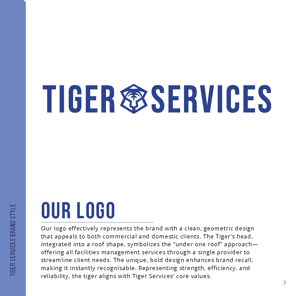
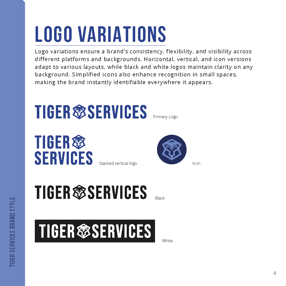
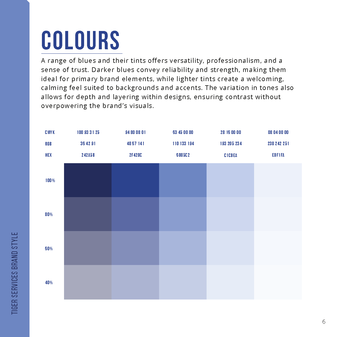
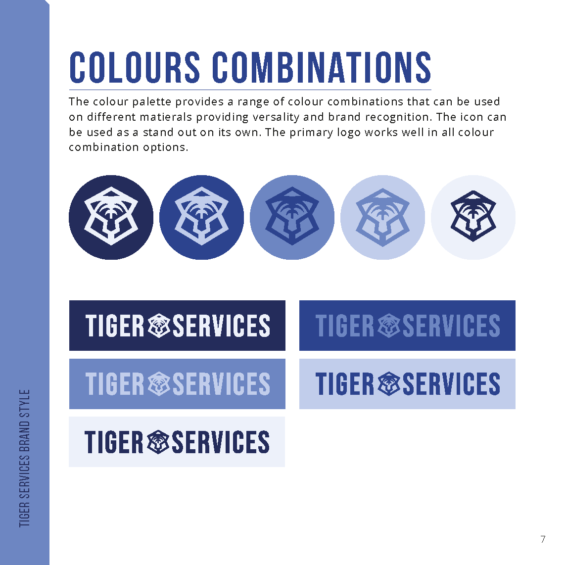
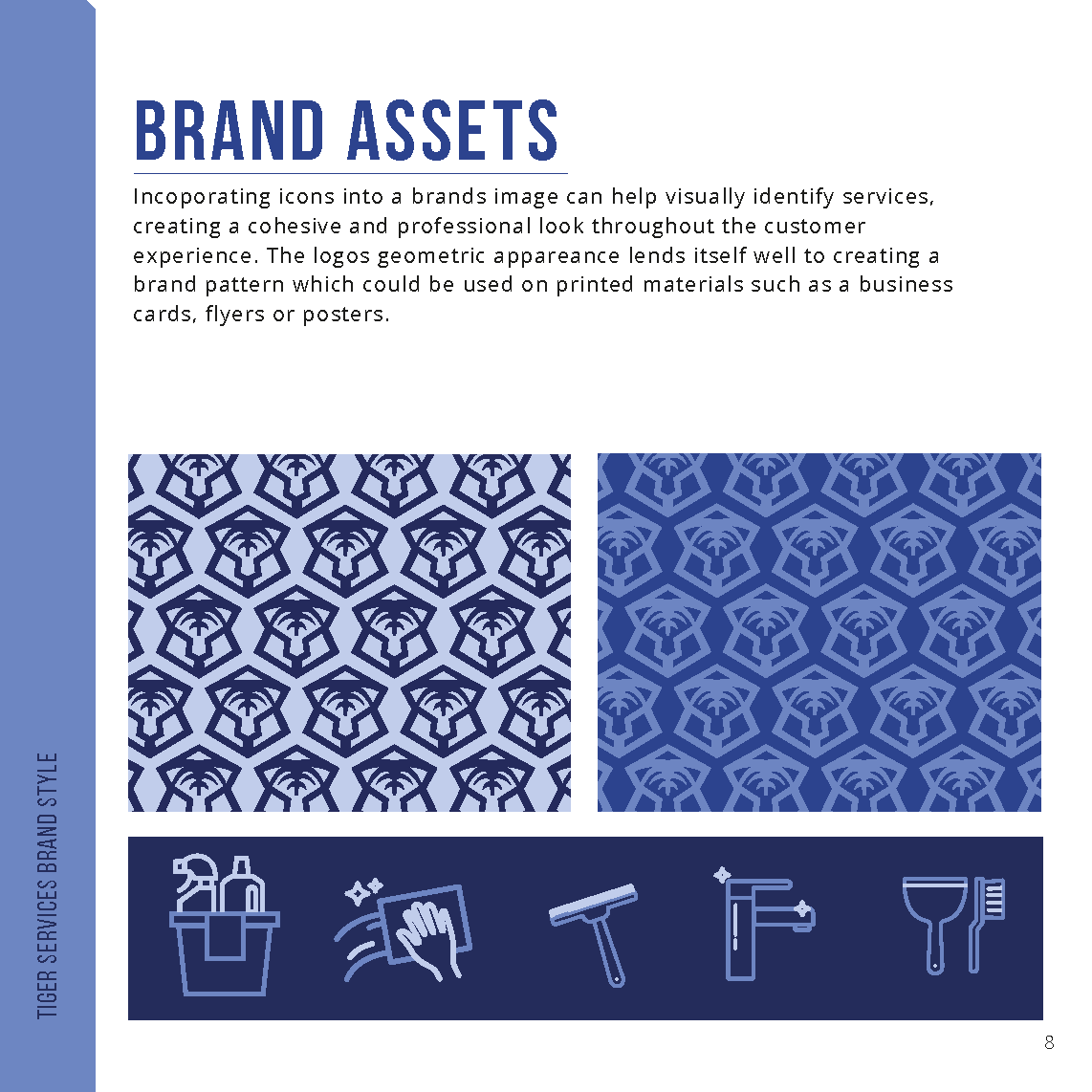
We began by getting to the heart of Tiger Services, uncovering their values, ambitions, and the strengths of the services they provide. We then held a discovery session to explore their goals, audience, and aspirations. From there, we moved into concept development, using the tiger as a symbol of strength and pride. We explored ways to combine this symbol with imagery reflecting domestic care, which led to the development of a clean, geometric logo that featured a tiger head within a roof structure, representing their “under one roof” ethos. To ensure the brand was consistent across every platform, we also created a full brand toolkit, which included typography, colour palettes, iconography, and usage guidelines.
Our Solutions and Outcomes for the Company
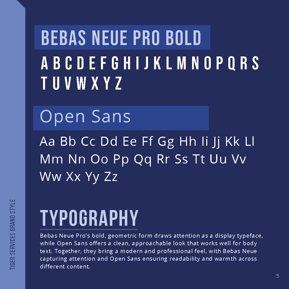
The new logo captured both domestic warmth and commercial strength, helping the brand stand out while still feeling trustworthy and approachable. The typography paired a modern, approachable mix of Bebas Neue Pro and Open Sans, while the colour palette combined deep and soft blues, giving the brand a calming yet professional feel. With the complete brand toolkit in hand, Tiger Services now had a set of assets, including icons, colour combinations, and templates that could be applied consistently across their social media, digital content, and print materials. The brand was also seamlessly applied to business cards and other real-world assets, ensuring a polished and unified presence across all touchpoints.
The Results and the Impact They Had on the Company
Since the rebrand, Tiger Services has seen a significant improvement in professional perception. Clients now instantly recognise the brand and associate it with reliability and professionalism. The consistent, cohesive visual identity across all materials, whether social media posts or business cards, has helped elevate their brand presence. The rebrand has also made Tiger Services more growth-ready, with a visual identity that reflects the company’s ambition to expand, supporting future business development and the broadening of their service offerings.

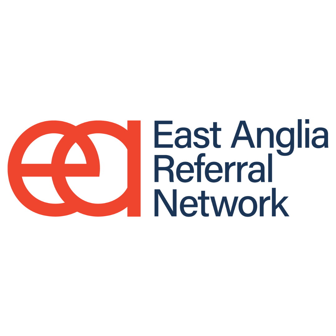
East Anglia Referral Network - EARN
Project Overview
Earn (East Anglia Referral Network) brings together local businesses, freelancers, and creatives who collaborate and support one another through networking and recommendations. The collective needed a unified brand identity that would reflect their strong sense of connection while appealing to a broad spectrum of professionals across the region. The goal was to create a modern, inclusive identity rooted in tradition that symbolised trust, energy, and collaboration.
Challenges the Client Was Facing
As Earn grew, they encountered common challenges typical of grassroots networking groups. The lack of a cohesive identity made it difficult to visually tie together their communications, events, and platforms. With such a diverse membership, spanning various industries and personalities, the branding needed to feel inclusive, neutral, and adaptable across sectors. Furthermore, the absence of a consistent visual language hindered their ability to create materials and expand the network’s visibility.
Read More
Our Approach and Process
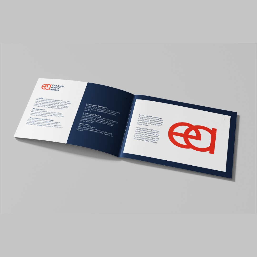
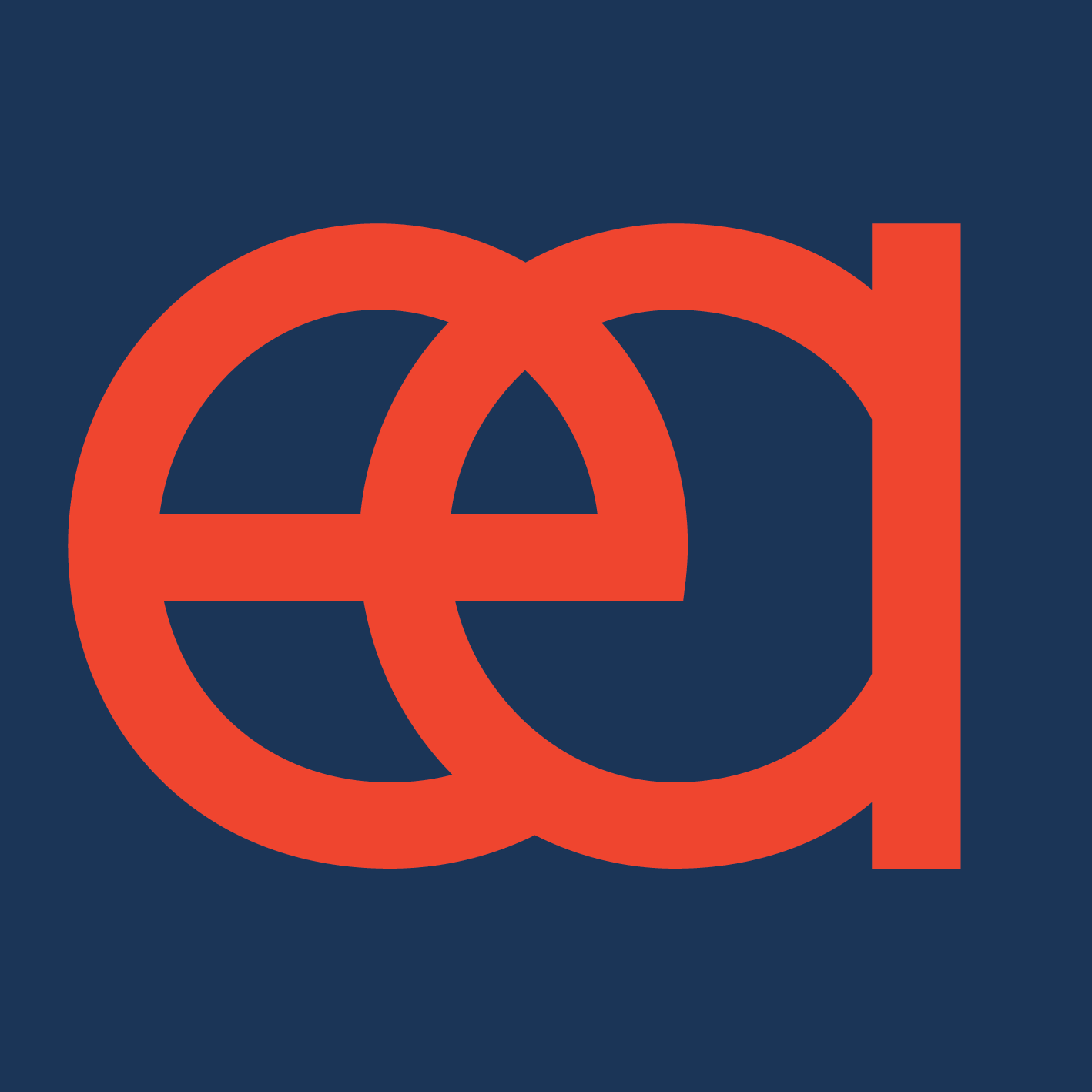
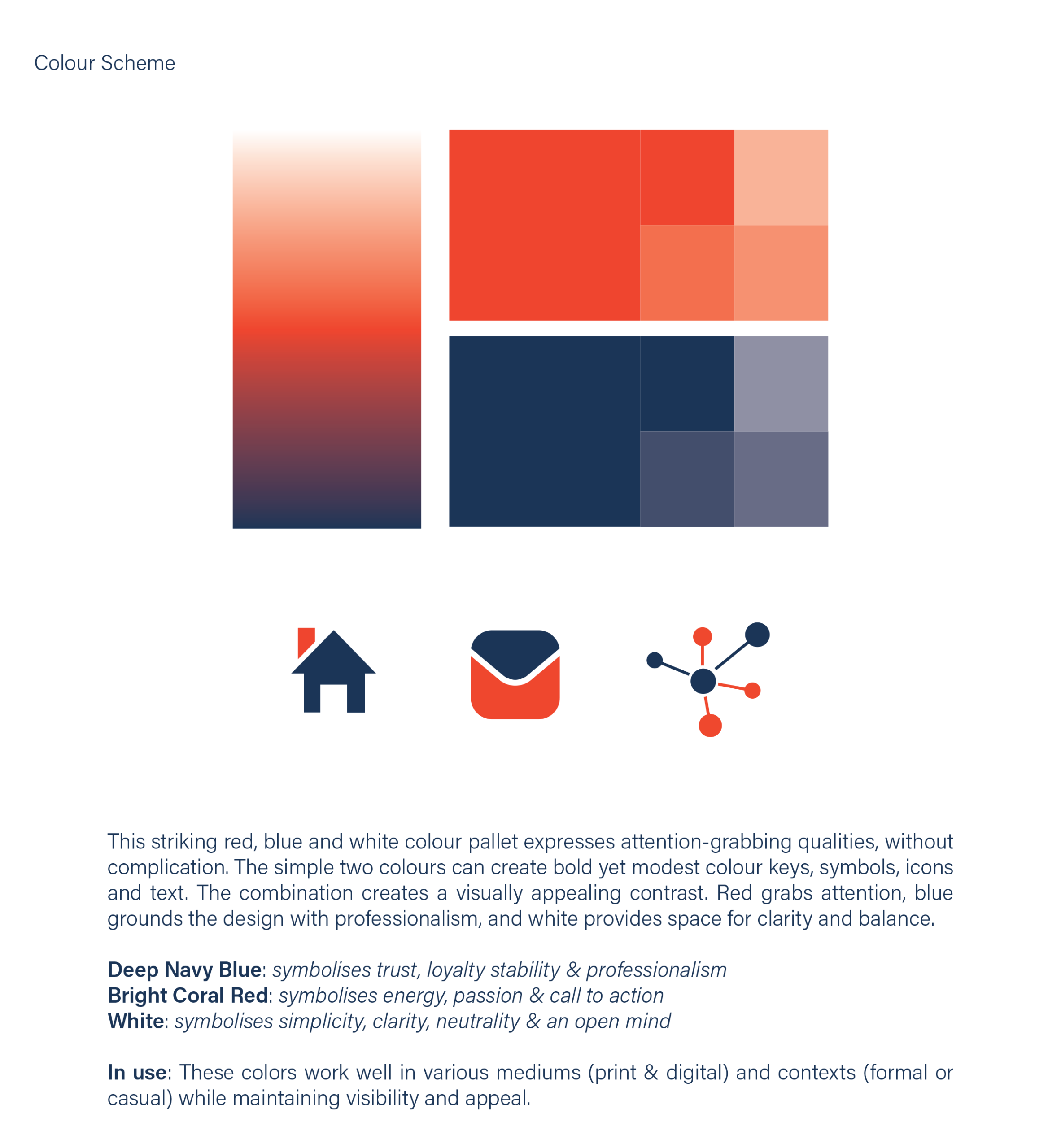
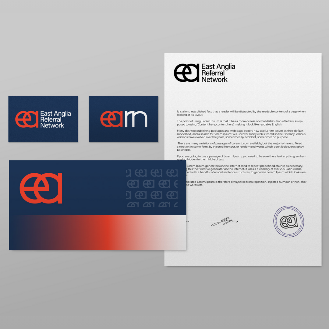
We understood that for Earn to grow and thrive, they needed a brand that was both professional and reflective of their creative spirit. We began by developing visual metaphors that captured Earn’s purpose – interconnectedness and mutual support. The logo we designed incorporated rounded lettering that echoed the links of a chain, symbolising strength through connection. Both a primary and secondary logo were created to offer versatility, allowing Earn to adapt to different formats and touchpoints seamlessly. For the colour palette, we selected red, blue, and white to create a modern yet timeless look, balanced with professionalism and energy. The choice of Acumin Pro as the typeface was intentional for its clarity and accessibility, ensuring consistency across materials. We also made sure to test the branding in different contexts, ensuring it would work well across both digital and print platforms, from formal presentations to social media posts.
Our Solutions and Outcomes for the Company
The result was a flexible and cohesive identity system, offering both a primary and secondary logo that could be applied to various communications without losing recognition. The logo’s chain-inspired design was both meaningful and memorable, reinforcing Earn’s mission of connection and mutual support. The carefully selected colour palette of blue, red, and white communicated professionalism while adding a touch of energy. The typography provided consistency and readability, ensuring the branding could be used effortlessly by Earn’s members. These branding materials allowed for a unified visual presence, making the brand accessible and easy to apply across a variety of platforms.
The Results and the Impact They Had on the Company
The new branding has given Earn a strong, unified visual identity that enhances credibility and professionalism within the local business community. The design’s accessibility and flexibility have made it easier for members to adopt and apply the brand, even without design experience. The refreshed branding has also helped Earn expand its appeal, attracting new members and strengthening the sense of belonging and legitimacy within the network. The result is a collective that is more recognisable, cohesive, and confident in its ability to serve and support the local professional community.
Restore
Project Overview
Bury St Edmunds Women’s Aid, a long-established charity, approached us to develop a new brand identity to celebrate their 50 years in the town. They wanted the rebrand to be more inclusive, embracing men, young adults, and a broader audience. The charity also wanted to move away from their dated purple logo, which had become associated with stereotypes of butterflies and rainbows, to something that felt modern, fresh, and inclusive. As part of this rebrand, the charity chose to change their name to Restore, a name that better represented their values and mission.
Challenges the Client Was Facing
Before the rebrand, the charity’s visual identity was outdated and didn’t reflect its evolving mission. The existing logo, with its purple colour and stereotypical associations, did not appeal to a broader audience, nor did it convey the charity’s commitment to being a modern, inclusive organisation. They were also looking for a name that more accurately represented their values of Respect, Empathy, Support, Trust, Outreach, Refuge, and Empowerment. The challenge was to create a design that felt both contemporary and welcoming, while still aligning with the charity’s core values and legacy.
Read More
Our Approach and Process
We began by understanding Restore’s values and mission, then worked on developing a modern and approachable visual identity. The new brand needed to appeal to a wide audience while communicating safety, support, and empowerment for survivors of domestic abuse. We chose a fresh turquoise and orange colour palette to represent the calmness and stability of the charity, as well as the warmth and energy it provides to its clients.
For the typography, we selected Brandon Grotesque, a sans-serif typeface known for its modernity and approachability. The use of lowercase letters adds a friendly, accessible feel that aligns with Restore’s desire to present itself as a contemporary and welcoming charity. The turquoise colour evokes feelings of trust and stability, while the orange highlights symbolise hope, encouragement, and action. We also included a circular full stop at the end of the brand name to represent completeness and unity, reinforcing the charity’s role in providing comprehensive support.
Additionally, we incorporated two hands within the ‘o’ of Restore to visually communicate outreach and the charity’s commitment to assisting those in need. The tagline, “Supporting Survivors. Restoring Lives.”, was carefully placed to complement the brand name without overshadowing it, ensuring that it clearly conveyed the charity’s mission.
Our Solutions and Outcomes for the Company
The new logo and branding for Restore communicate the charity’s core values of progress, hope, support, and empowerment for survivors of domestic abuse. The modern design, paired with the vibrant turquoise and orange colour palette, gives the charity a fresh and professional look while remaining approachable. The symbol of the hands and the circular full stop add meaningful elements that represent the charity’s holistic approach to supporting survivors.
We also developed a brand toolkit, which included typography guidelines, colour specifications, and usage recommendations to ensure consistency across all of Restore’s communications and marketing materials.
The Results and the Impact They Had on the Company
The refreshed brand identity successfully positioned Restore as a modern, inclusive, and approachable charity, which has helped attract new supporters and foster stronger connections with the local community. The new visual identity has enhanced brand recognition, providing the charity with a cohesive, professional look that can be easily applied across digital and print materials. The new name, Restore, and the associated branding have allowed the charity to better communicate its values and mission, making a positive impact on its reputation and reach. This rebrand has also helped position Restore for future growth and expansion, ensuring they are ready to serve a broader audience and continue their essential work in supporting survivors of domestic abuse.


Inspired to Build Your Brand?
Each of our case studies showcases the power of great design. From strategy to execution, we’re passionate about helping brands like yours reach their full potential. Ready to bring your vision to life?
