

From Concept to Shelf: Watermans Brand Packaging Case Study
Background: the roots of Watermans
Born out of their personal battles with hair loss, Watermans Founders, Gail and Matt Waterman, have built a global business with a network of distributors that sell a product every 30-seconds. Watermans isn’t just another hair care brand. They pride themselves on making products using only the finest ingredients, and always with a focus on putting customer results before profits. At the heart of the business is a genuine desire to make a difference by supporting communities and organisations across the UK.
Brief: creating an identity for Frojus
The brief presented to the Whitewater team was to capture the essence of Watermans' new product, Frojus, which they’ve developed for individuals with curly, Afro-Caribbean, and/or hard-to-manage hair.
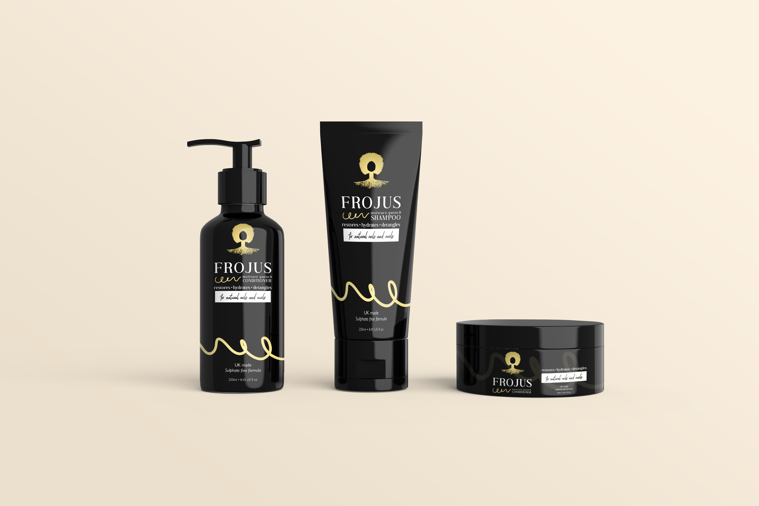
Watermans already had a logo design, which they liked, but the packaging ideas previously created didn’t align with the luxury feel they wanted to convey. Our brief was to come up with new packaging concepts to elevate the Frojus aesthetic, and ensure the product stands out on shelves next to their competitors.
Approach: blending tradition with innovation
Our approach was to first look at existing product designs in the Watermans range. Then we conducted a thorough competitor analysis, studying market trends and packaging designs. Watermans' preference for minimalist aesthetics informed our use of a monochromatic palette, and we combined handwritten fonts with their existing brand font to give a friendly and approachable feel.
As a nod to the natural ingredients in the product, we gave logo options in different shades of green as well as their primary gold, and we also created graphics to depict the Froju curl element. We brought these concepts to life as a mock-up tube, tub, and bottle to make it easier for the client to visualise how the finished designs would look.
Outcome: packaging that speaks volumes
The mock-ups helped Watermans to veto some designs and inspired further ideas to come through. We worked together to narrow down to two design options, and now a final design has been chosen that effectively communicates the premium, luxury nature of Frojus, and resonates with the values of Watermans and its customers.
Here’s what the team at Watermans had to say about our work together…
“Working with Whitewater Creative has been an absolutely transformative experience for our project. From the moment we started, Ellie was a standout with her incredible design skills, intuitive understanding of our needs, and her ability to bring our vague ideas to life in ways we couldn't have imagined. Her designs were not only aesthetically pleasing but also highly functional, meeting the needs of our project perfectly. What impressed us the most was how Ellie made the entire process seamless and stress-free. Her professionalism, creativity, and attention to detail were evident in every interaction, making it clear that we were in very capable hands. Our experience with Whitewater's Design Services, especially Ellie's contribution, has exceeded our expectations, and we can't recommend them highly enough. The end result speaks for itself, and we are incredibly proud of the work accomplished in partnership with Ellie and the team.”
If you’re looking for packaging options and designs that stand out and want the expertise and support of an agency at the cutting edge of design and marketing, look no further. Get in touch with Whitewater today and let’s take your brand to the next level.